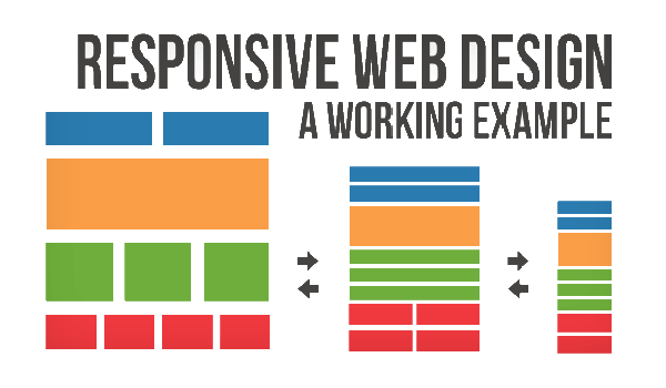
A site designed with RWD adapts the layout to the viewing environment by using fluid, proportion-based grids, flexible images, and CSS3 media queries, an extension of the @media rule.
- The fluid grid concept calls for page element sizing to be in relative units like percentages, rather than absolute units like pixels or points.
- Flexible images are also sized in relative units, so as to prevent them from displaying outside their containing element.
- Media queries allow the page to use different CSS style rules based on characteristics of the device the site is being displayed on, most commonly the width of the browser.
- Server-side components (RESS) in conjunction with client-side ones such as media queries can produce faster-loading sites for access over cellular networks and also deliver richer functionality/usability avoiding some of the pitfalls of device-side-only solutions.
Responsive website design is a technique used when building websites to allow one site to adjust to multiple screen sizes. Not only does Google love responsive designed websites but they are simply far better and easier to use than non-responsive designed websites.
A responsive website changes its appearance and layout based on the size of the screen the website is displayed on. Responsive sites can be designed to make the text on the page larger and easier to read on smaller screens. They can also be configured to make the buttons on the phone's screen easier to press. More sophisticated ways of using responsive design on a mobile device include: formatting the website to hide or present entirely different information, radically changing the graphics and colors, or even reducing the site to emphasize just its most important piece.
Related concepts
Mobile first, unobtrusive JavaScript, and progressive enhancement
"Mobile first", unobtrusive JavaScript, and progressive enhancement (strategies for when a new site design is being considered) are related concepts that predated RWD: browsers of basic mobile phones do not understand JavaScript or media queries, so the recommended practice is to create a basic web site, and enhance it for smart phones and PCs rather than try graceful degradation to make a complex, image-heavy site work on the most basic mobile phones.
Progressive enhancement based on browser, device, or feature detection
Where a web site must support basic mobile devices that lack JavaScript, browser ("user agent") detection (also called "browser sniffing"), and mobile device detection are two ways of deducing if certain HTML and CSS features are supported (as a basis for progressive enhancement) however, these methods are not completely reliable unless used in conjunction with a device capabilities database.
For more capable mobile phones and PCs, JavaScript frameworks like Modernizr, jQuery, and jQuery Mobile that can directly test browser support for HTML/CSS features (or identify the device or user agent) are popular. Polyfills can be used to add support for features e.g. to support media queries (required for RWD), and enhance HTML5 support, on Internet Explorer. Feature detection also might not be completely reliable: some may report that a feature is available, when it is either missing or so poorly implemented that it is effectively nonfunctional.
Challenges, and other approaches
Luke Wroblewski has summarized some of the RWD and mobile design challenges, and created a catalog of multi-device layout patterns. He suggests that, compared with a simple RWD approach, device experience or RESS (responsive web design with server-side components) approaches can provide a user experience that is better optimized for mobile devices. Server-side "dynamic CSS" implementation of stylesheet languages like Sass or Incentivated's MML can be part of such an approach by accessing a server based API which handles the device (typically mobile handset) differences in conjunction with a device capabilities database in order to improve usability. RESS is more expensive to develop, requiring more than just client-side logic, and so tends to be reserved for organisations with larger budgets.
Although this challenge has become recently a minor issue, with many of the publishers starting to support responsiveness, one still at least partly existing problem for RWD is that some banner advertisements and videos are not fluid. However search advertising and (banner) display advertising support specific device platform targeting and different advertisement size formats for desktop, smartphone, and basic mobile devices. Different landing page URLs can be used for different platforms, or Ajax can be used to display different advertisement variants on a page.
An alternative to RWD is the method of Adaptive Web Delivery or AWD that is adopted by consumer brands worldwide. Although, it is very similar to Responsive Web Design, with adaptive delivery, the most significant difference is that the server hosting the website detects the devices making requests to it, and uses this information to deliver different batches of HTML and CSS code based on the characteristics of the device that have been detected.
There are now many ways of validating and testing RWD designs, ranging from mobile site validators and mobile emulators to simultaneous testing tools like Adobe Edge Inspect. The Firefox browser and the Chrome console offer responsive design viewport resizing tools, as do third parties.
History
Ethan Marcotte coined the term responsive web design (RWD) in a May 2010 article in A List Apart. He described the theory and practice of responsive web design in his brief 2011 book titled Responsive Web Design. Responsive design was listed as #2 in Top Web Design Trends for 2012 by .net magazine after progressive enhancement at #1.
Mashable called 2013 the Year of Responsive Web Design. Many other sources have recommended responsive design as a cost-effective alternative to mobile applications.
Google recommends responsive design as one of three options in its Guide: How to Approach Multi-Device Sites for Your Business?


